
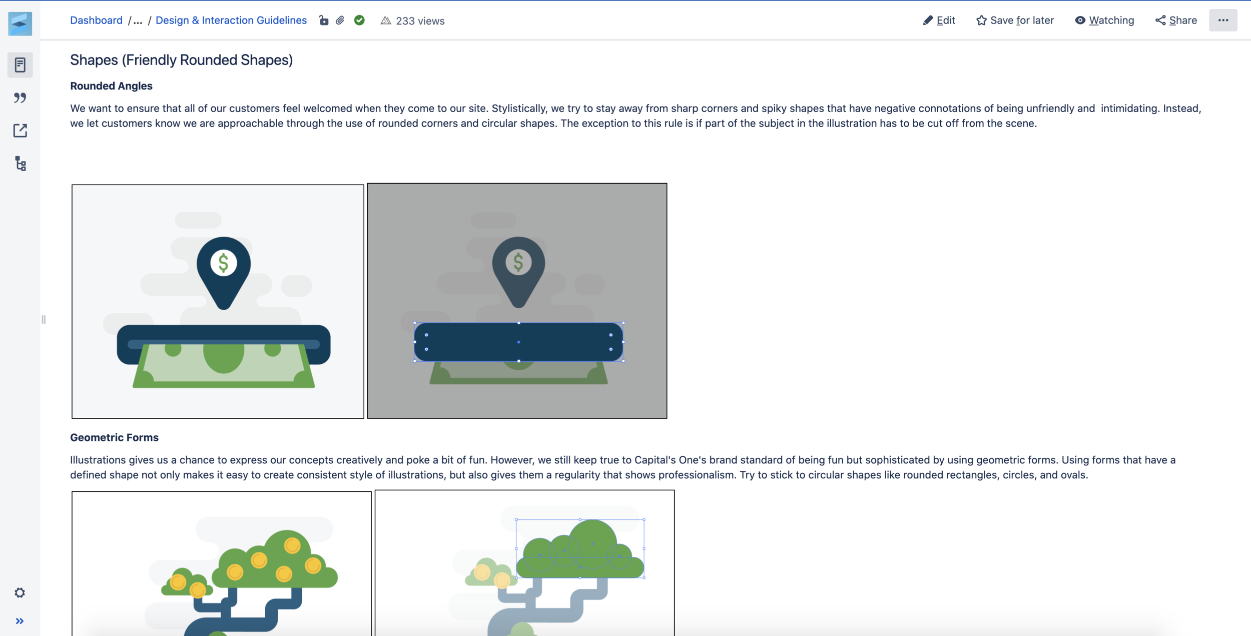
The Site Illustration Guidelines
Illustrations serve an important role in finding the brand voice and telling a lush story to the customers. The lack of comprehensive illustration guidelines kicked off the effort for Site team to design their own illustration styles, influencing Brand. I lead this work to pitch, define, and document the Site illustration guidelines while also creating the illustration assets.
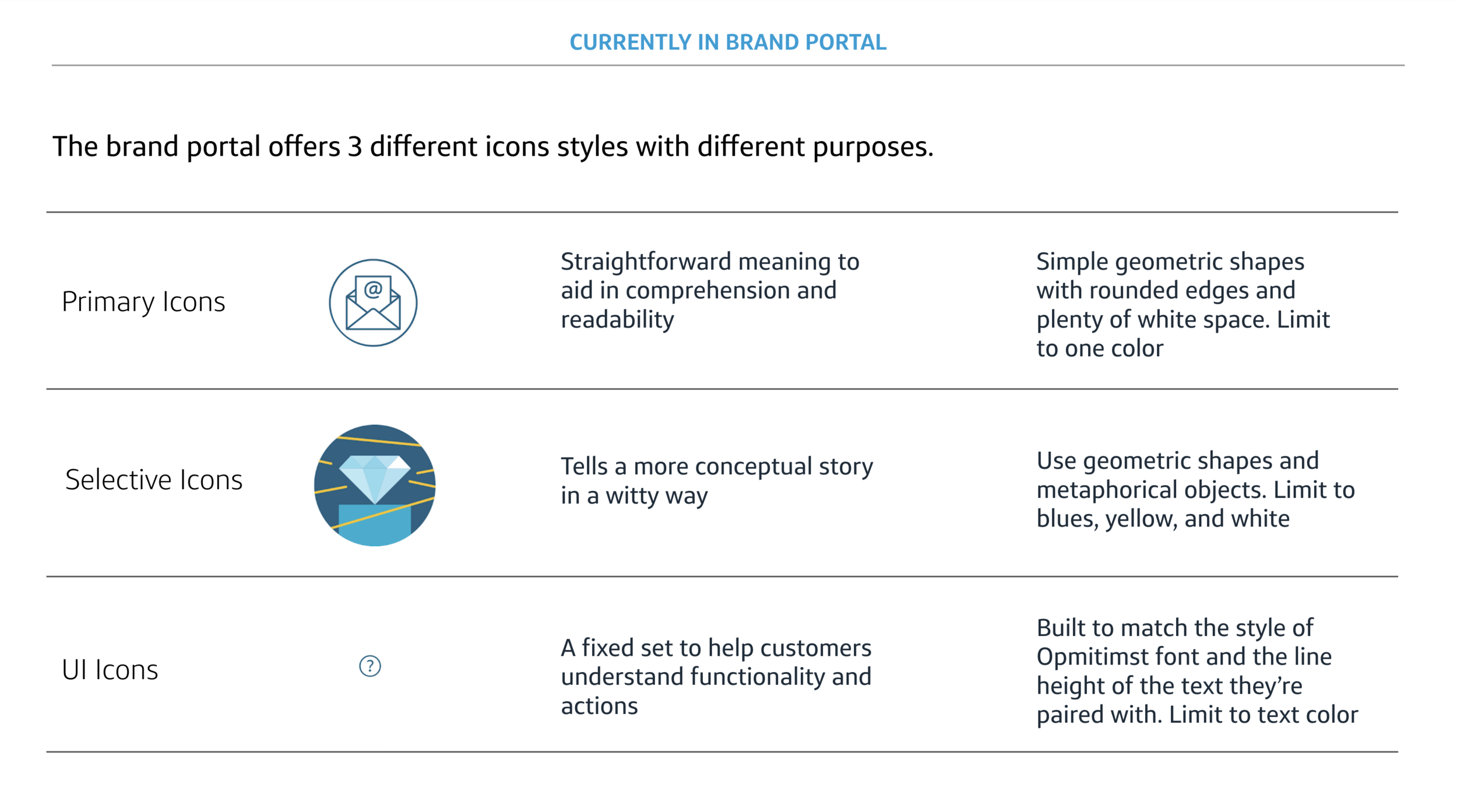
Capital One Brand Iconography
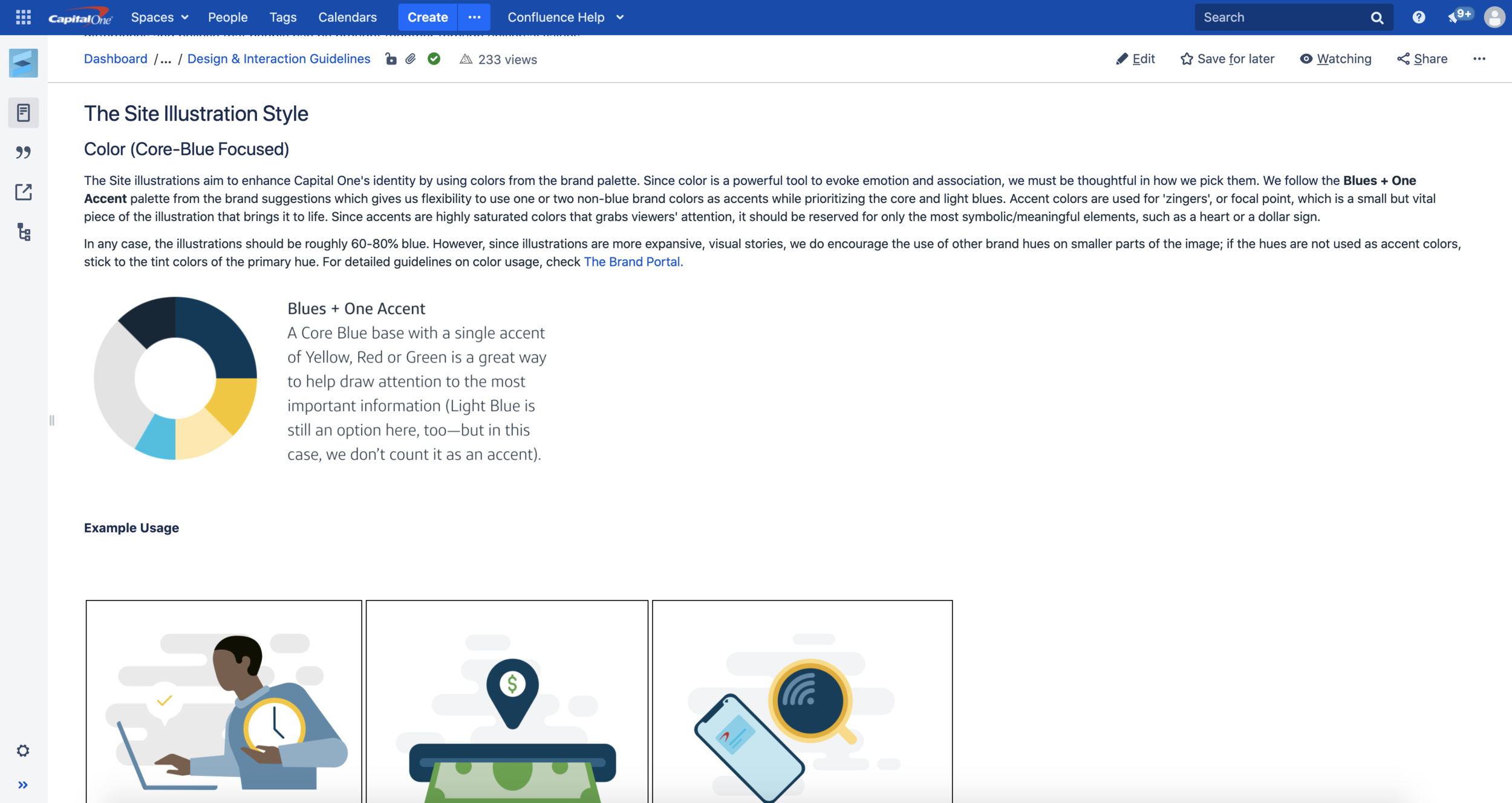
Capital One has 3 types of iconography that are used for wayfinding at different contexts— Primary, Selective, and UI icons. They help to enhance communication of messages and enrich content on our digital platforms. The iconography system is an important element in how brand personality comes to life visually, making consistency a key characteristic.
One of the principles in our Brand guidelines is that icons should guide people through a design or experience and should be be used to fill negative space or add to your design. However, what happens when you do need to add to your design for more expansive storytelling?

Defining the Needs
Expert Review
The first conversations of illustrations on the Site began with the expert review. The review consisted of a panel of design experts from across the organization. The purpose of this Expert Review was to evaluate the design of the In-Flow page concepts which featured the new Site components as opposed to the designs before the design system.
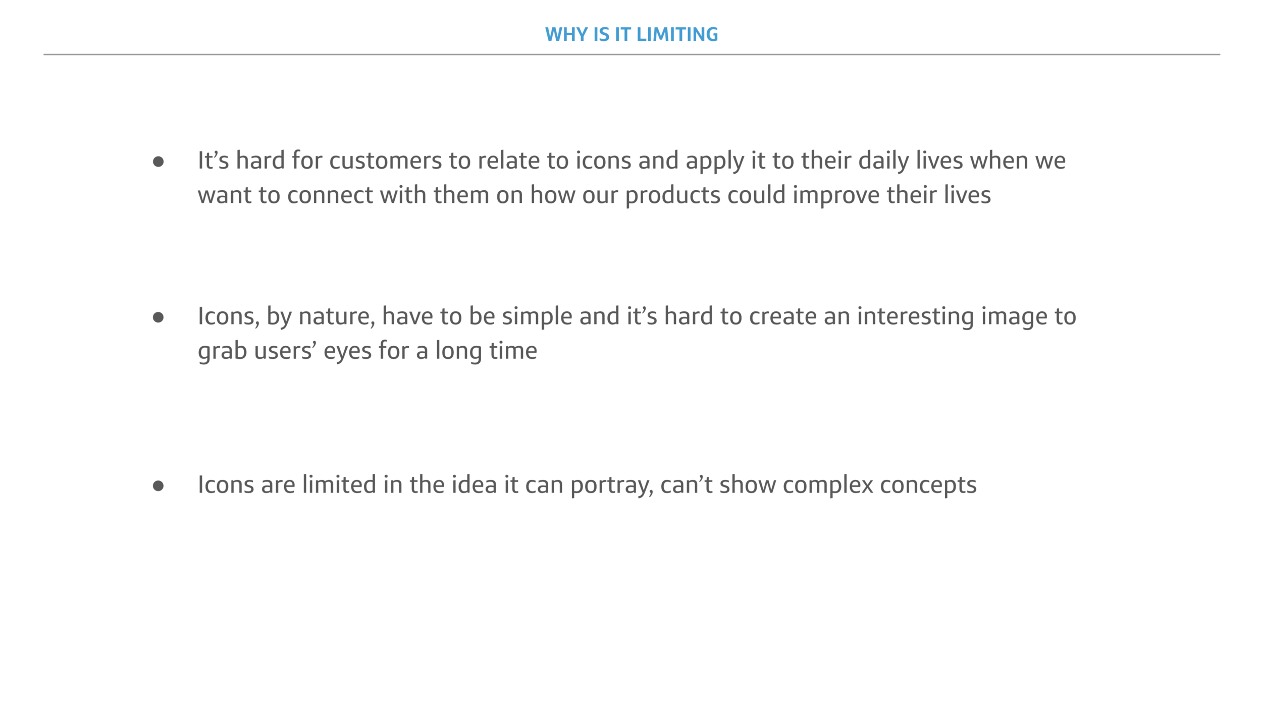
The review revealed that the Callout component —which uses selective icons and set of text to highlight promotional features— scored low for UX clarity. The confusion arose from:
Circular icons seeming to indicate interactiveness, when the icons aren’t clickable
The icon imagery does not match the message accurately, or are too metaphorical
Multiple icon styles are being used within the same page and their purpose is confusing
This raised the issue of the icon sets. The icons could not be taken out of the circular frame that made them seem interactive because brand guidelines forbid modification of existing icons. In addition, the selective icon library was not expansive enough to support the Callout component, which would switch out the stories being featured periodically.
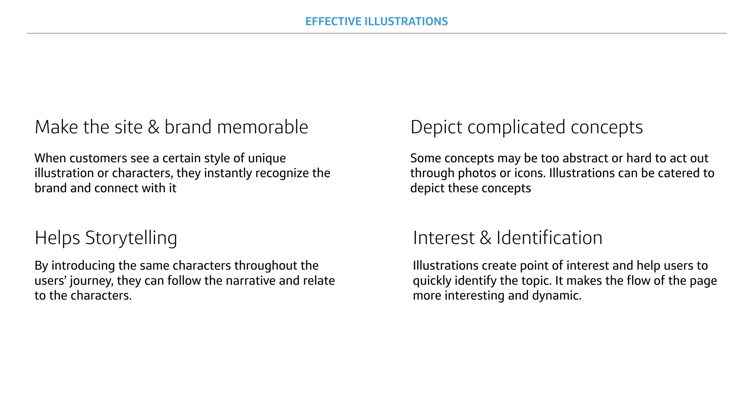
Illustration Pitch
Since there were no defined set of illustrations from brand, using illustrations would give the Site flexibility to create customized visuals, as well as taking away the circular frames that indicate interactivity. It would also allow or more complex storytelling for abstract concepts related to financials.
I put together a pitch deck and got an approval from my team and Brand to begin this effort.
Ideation
Competitive Analysis
I researched other companies with a distinct visual brand to narrow down what makes them so effective. These brands included Plaid, Wealthfront, and Eero that have a balance between playfulness and serious voice Capital One advocates for.


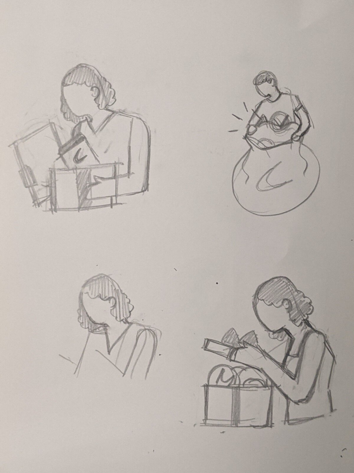
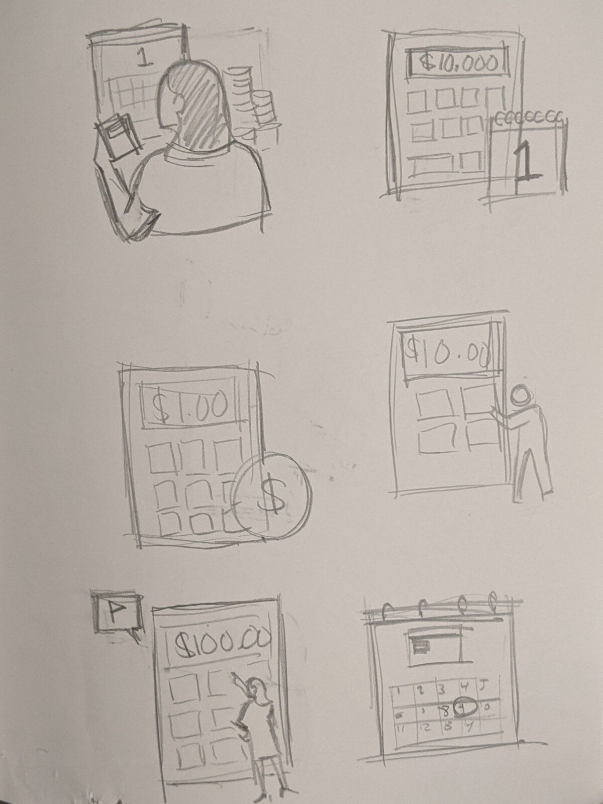
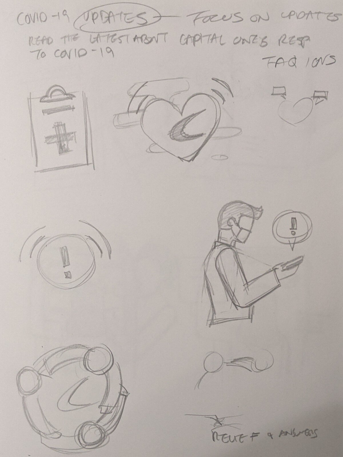
Exploring Styles
I played around in illustrator with different styles of illustrations that ranged from abstract to editorial/ realistic. Ultimately, we wanted a style that is scalable and simple so it could be recreated by other designers.
Using Capital One’s core values, I crafted a set of illustration principles that I used to build the final illustration styles. These aligned principles helped the illustrations stay consistent with the existing icons and doesn’t distract users too much in the spaces they are used.

Finalizing Site Style
A set of illustrations using the finalized style has been presented to the org leadership and Brand team. It was then approved for usage on the live Home page. View them live here.


Guideline Documentation
Once the new Callout component was out and now required illustrations rather than selective icons, there was a need for guidelines around illustrations that other designers could use as a reference so they could create their own assets.
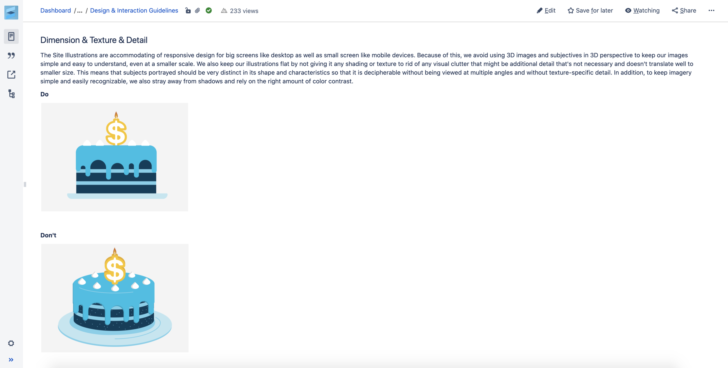
I documented things like the Site illustration principles, appropriate usage for illustrations, style characteristics, and do’s and don’t’s. This guideline proved itself to be effective when we worked with an external agency that created extra illustration assets in the Site style using my documentation.

External agency illustration work using Site guidelines
Brand Adjustments
The initiation of official Site illustration style guidelines pushed Brand to expedite the universal illustration guidelines, as it proved the need for more expansive visuals on not only the site, but across the org. The Capital One brand illustration guidelines were released 7 months after the Site illustration guidelines have were published.
Brand Illustration Guidelines
The Site illustrations were featured in the Brand illustration guidelines. I worked with Brand to advise on types of information that would be helpful for designers who are starting the illustration process.
There were guidelines that were decided at Brand level which misaligned with what had been put out by Site guidelines, however. For example, Brand guidelines emphasized having realistic skin tones and hair colors, when the Site guideline stuck to having non-denominational skin tones, or, ‘blue people’.

A page from the Capital One Brand Illustration Guidelines
Changes to Final Assets
Site illustrations were adjusted to Brand standards accordingly. Aligned the the newly released brand guidelines, Site guidelines found itself at a good place to start expanding into other LOBs as well.

